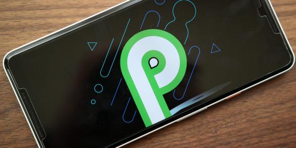
Android P brings a whole bunch of new updates to Google’s operating system, and one of the biggest is the new, gesture-based interface system. A system that many (including us) have noted is pretty similar on the surface to the one that Apple introduced on the iPhone X last year. Which of course begs the question: who’s doing gestures better?
(Before we begin: yes, I am well aware that companies like Palm have had extremely similar systems like this first, but unless you’re still using a Pre, that’s not super relevant to this conversation.)
Having tried out the two systems, there’s a lot of good ideas in Android’s iteration of the function, but as others have already noted (like David Ruddock at Android Police), Google just isn’t willing to commit fully to the gesture system, leaving P stuck somewhere between Google’s old software buttons and something more fully developed like the iPhone X.
First, the good: Google has done a great job making the gestures fluid and responsive, and the horizontally scrolling multitasking menu is great (I was personally never a fan of the old, vertically scrolling interface.) The animations are also great, adding a good sense of motion to the OS without slowing things down, although it’s possible less powerful Android phones could have an issue. And the newly added permanent search bar and access to the app drawer from anywhere in the OS are vital additions that I don’t know how we went without for so long.
But the problem is that unlike Apple, Google is trying to have its cake and eat it too — sure, the gestures are there, but for crucial things like the home button and back button, it’s sticking with regular old tappable buttons. Adding to the confusion is that the back button is now contextual, only appearing in certain situations where you can use it.
/cdn_vox-cdn_com/uploads/chorus_asset/file/10793633/slide_close.jpg)
But the biggest sin of the Android P gestures is that because Google is sticking to its halfway mentality, the gestures don’t actually save any UI space, because Android still reserves the same bottom chunk of the screen for the virtual buttons.
Apple’s gestures also beat out Google’s when it comes to quickly switching between apps. While both allow you to swipe on the home bar to scroll between apps, Apple’s is a far more seamless process, bouncing you from one app to the next at lightning speed without first bringing up the full multitasking menu. Google’s system doesn’t offer quite that level of convenience, instead bringing up the full scrolling menu each time, even if you’re just flipping back and forth between two apps. It’s a bit slower and jankier than Apple’s system, although Google’s is probably better if you need to scroll farther back to a less recently used app.
/cdn_vox-cdn_com/uploads/chorus_asset/file/9598999/jbareham_171031_2099_A_0087.jpg)
There are a few areas where Google’s gestures top Apple’s, though. The fact that you can close apps from the multitasking view with just a swipe up, instead of first having to hold down on the preview before you can quit is something that Apple quite frankly needs to enable on its own devices. Access to the suggested apps and search bar from that menu is also far more useful than Apple, which places it in a separate part of the OS.
It’s important to keep in mind that Google is still working on Android P — this is just a developer preview, so it’s all possible that this could still change between today and the final release in the fall. But in its current iteration, Google is still stuck between the old button-based UI of the past and the gestures of the future, and if P is going to try to top Apple’s system here, it’s going to need to pick a side.


